There's a myth that beautiful design and high-converting design are rivals. In practice, the highest-converting pages we've shipped are also the best-looking ones — because both qualities come from the same discipline: intention.
Visual hierarchy is persuasion. The eye should travel your page the way a good salesperson runs a meeting: problem, promise, proof, price, action. If a visitor's eye wanders, your hierarchy — not your visitor — is at fault.
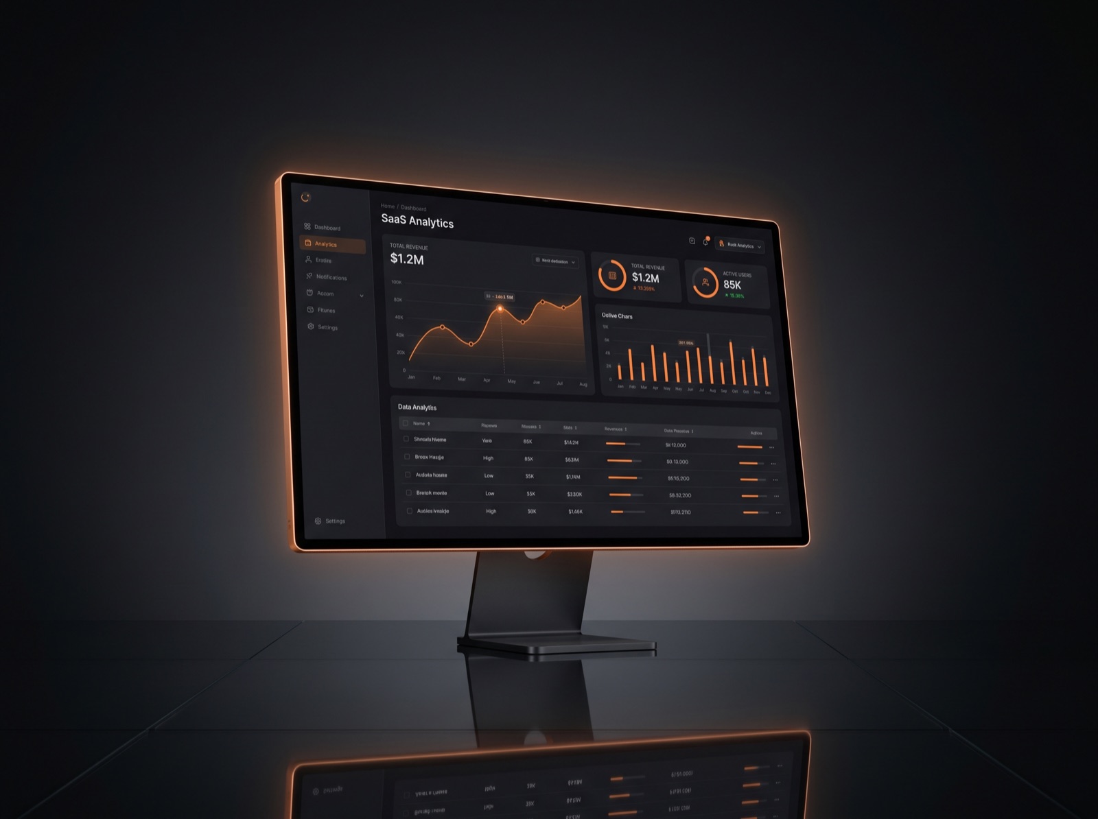
Trust is designed, not claimed. Real product imagery, specific numbers, recognizable logos, generous whitespace and zero typos quietly tell visitors 'professionals live here'. One cheap-looking section can undo all of it.
Friction is the silent killer. Every extra form field, every unclear price, every 'contact us for pricing' costs you a percentage of buyers. We publish prices, shorten forms and offer a free preview precisely because removed doubt converts better than added pressure.
And finally: motion sells when it serves. A price card that lifts on hover invites a click. A counter that animates makes a stat feel alive. The moment motion exists for its own sake, it starts costing you money.
Beauty earns attention. Intention converts it.